Obsidian Document Properties

I have long resisted a deep dive into the app Obsidian, but a couple of days ago I took the time to set up a vault an fill it with content. Surprisingly, the feature that created the most fascination is a recent addition: document properties.

I’ve always been a meta-data nerd in all note-taking approaches I have worked with so far. There is no other solution that comes even close to what Obsidian provides. Meta-data are not just treated as text. It is possible to define the type of a piece of meta-data in terms of whether it can be a list, a number, or even a checkbox.

I’m still just starting to find out what can be done using this feature. But it alone may be enough to make me switch to Obsidian wholesale.

Castro gets first update after nearly a year

I was starting to be convinced that the podcast player Castro were abandoned, after nearly a year without updates or explanations on the blog what was going on, which is very unusual for an app on a subscription business model. And yet, just a couple of days ago, an update hit the app store.

As can be expected, the list of changes is significantly longer than the list of changes of previous updates. The changes themselves are certainly nice improvements, but nothing game-changing. And I’m still puzzled why so much time had to pass between updates.

I stopped using Castro in late summer of 2022, when the last update was already suspiciously long ago1. After a short stint with Overcast, I reactivated my old Pocket Casts account and haven’t looked back since.

Of course, I have given the new Castro a try, but I came out disappointed. For example, Castro still had all my subscriptions. But it would not update them, whatever I tried.

Finally, I had to clean up the existing subscriptions and imported my current subscriptions from Pocket Casts. I have several subscriptions to podcasts associated with membership accounts. Unfortunately, Castro did not hold up well with these subscriptions. Some of them simply did not work.

During this time of kicking the tires, Castro underwent several crashes, which did not increase my confidence. I used to be a long-time fan of Castro, but with Pocket Casts I now have found a more-than-adequate replacement.

Pocket Cast has really benefitted from the acquisition by Automattic. When I tried it after the short stint withOvercast, I was positively surprised about the state of the app. In contrast to Castro, Pocket Casts is not only available on the iPad, there is also a Mac version. Plus, updates are shipped at a heathy rate.

The roots of Pocket Casts are still visible and remind me of the time I started to use the app on and off, at least for some period between 2016 and 2018. The Pocket Casts of 2016-ish did not stick, but the current iteration has a much better chance to stay.

  1. The deal with subscription business models is that developers ship updates from time to time, especially if the developer charges around twice the money that their direct competitors ask for.
    I understand that a subscription model is a convenient way to make money and fund a continuous development of an app. But the other side of the medal is that by taking subscription money a developer also needs to accept the obligations that come with it.
    And if updates fail to show up without any explanation at all, customers get cranky.

Editing of Icon Layout on iOS Home Screen

Another WWDC is in the books. Announcements have been made for iOS 16 and iPadOS 16. Still, no consideration of a less frustrating way to rearrange the icons on an iOS/iPadOS home screen.

The current situation of getting the icons to wiggle, and then hope for the best as you drag them around with your finger is a serious usability issue that annoys me with inconsistent behavior every single time I have to do it.

Lire

The usage of an RSS reader app represents a significant part of my daily media diet. I’ve been through “all of them”, switched back and forth between the different apps. Satisfied, but never fully happy with my choices.

I briefly used Lire1 for some time a couple of years ago, became unhappy with some random detail, and moved on to one of the “usual suspects”: Reeder, Fiery Feeds, Unread.

Out of frustration over some aspects of the mentioned alternatives, I came back to Lire some months ago. For the larger part of the last year, I have been using Lire exclusively for my feed reading. The app undoubtedly has its ups (many) and downs (few), but overall the state of the app has been a very welcome surprise to me.

Without further ado, what I really like about Lire is the reading experience. The text parser keeps impressing me. It hands down delivers the best text processing results I have ever seen in any RSS reeder app. In the few cases where I submitted a request for improvement to the developer of Lire, the improvement was implemented and rolled out in less than a day!

I do the majority of my feed reading on my 12.9 iPad Pro, where I have the choice to read the text in a three-pane, two-pane, or full-screen layout. Personally, I use the three-pane layout for quickly browsing through a list of articles, switch to the two-pane layout for articles that I want to focus on, and expand to the full-screen layout mostly for articles with many pictures.

Lire even goes the extra mile to also parse the text of a linked post, no forwarding to a website (as for many other apps) required. That’s the attention to detail that really makes a difference.

Tables are rendered cleanly and (yay!) footnotes appear as little pop-ups, bigfoot style.

Lire supports a large selection of RSS aggregator services, but can (unlike, e.g. Reeder) only sync to one service at a time. There are apps that sync and cache feed text faster than Lire, but not by a meaningful amount.

It is possible to inline frames in the reading pane2. If the inlining is deactivated, videos will immediately play full-screen (this is one of my favorite features).

The overall product quality of the app is great. Lire is very stable and crashes are very rare, especially in comparison to some direct competitors.

The only minor issue that I still have with Lire is the design. Maybe it is just me, but the available app icons feel like they have been rushed out of the door without getting the polish they deserve for representing such a capable app.

I don‘t expect a masterpiece akin to the white-star-on-red-background „classic red“ icon available in Reeder3, but maybe a little bit of originality wouldn‘t hurt.

Lire offers three light and three dark themes and supports automatic theme switching controlled by the system settings. The available themes4 are okay-ish, but in my opinion lack a bit of “personality”. Especially the light themes suffer from too much greyscale, in my personal opinion.

In summary: for me, Lire already represents an almost unbeatable package for RSS reading. A fresh coat of paint and — one can dream — the ability to use custom fonts in the article view would make Lire an even stronger recommendation.
  1. Lire is available on iOS/iPadOS and macOS. Personally, my usage of Lire is almost entirely on iOS/iPadOS. Although I have purchased the Mac-version, I rarely use it at all (which is not at all Lire‘s fault, I just don’t use a Mac nearly as frequently as I use iOS devices). 
  2. I have deactivated this option and never used it because the benefits of not inlining frames outweigh the nicer appearance by a lot. 
  3. The „classic red“ icon available in Reeder is definitely my all-time favourite iOS app icon. 
  4. There is no support for custom themes. To my knowledge, custom themes are only supported in Fiery Feeds, which (frankly speaking) also doesn’t have a world-class built-in theming. 

Albums are hard

During the warm-up talk for episode 443 of the Accidental Tech Podcast, Marco Arment complained about an album that was broken in Apple Music such that Apple Music would – to his anger – not play the album as it was recorded. Instead, it would mix the track list in the studio album from different live and studio recordings of the band.

I can totally understand the frustration because it happened to me as well in some cases. This is especially frustrating if it occurs in an album where you know every tune by heart and can recognize even the slightest difference, created e.g. by replacing a specific track by another recording from a different album. Apple Music is definitely no stranger to that.

Marco then mentioned that – in contrast to Apple MusicSpotify would play the album flawlessly, as it was recorded. So, I was thinking to myself: what if Spotify1 is really the better alternative for listening to music in the way it was intended by the artists, instead of becoming subject to the weird choices of Apple Music?

This anecdote got me into thinking about an experiment. I launched the Spotify app and told it to play one of my all-time favorite albums, Bruce Springsteen’s 1975 concert recording at the Hammersmith Odeon, London, UK.

Spotify started playing2, and already the first played track was not belonging to the live recording. It was taken from a studio recording3. The next played track also did not belong to the the correct live recording. It was taken from the studio album The River. And so it went on.

In total, the set list played by Spotify was composed of no less than four (!) different studio albums, plus (believe it or not) tracks from the actual Hammersmith Odeon recording.

Of course, this is (hopefully) not representative of the capabilities of the Spotify service. It’s probably better than that. But on this afternoon, the laugh was on it.


  1. I’m not really a Spotify user. I created an account a couple of years ago, just to kick the tires. 
  2. Admittedly, I’m such a light user of Spotify‘s service that I don’t even know how to stop the player from shuffling the tracks. 
  3. Born to run, if I remember correctly. 

Sublime Text 4

After having used Visual Studio Code almost exclusively for a significant part of my work for about the last two years, I have taken the new release of Sublime Text 4 as an opportunity to kick the tires of the fourth iteration of my long-time trusted workhorse1.

I have never used Visual Studio Code as an IDE2, my main use case has always been to use it as a powerful text editor. And powerful it is. But so is Sublime Text, albeit in a different way.

After using Sublime Text again for some amount of time in my daily work, I’d still prefer Visual Studio Code for all tasks that benefit from having a live preview directly in the editor3, such as writing texts in Markdown or creating [Plant UML diagrams].

On the other hand, Sublime Text‘s extensibility features have always been way more accessible to me than the pendant in Visual Studio Code. And boy, have I missed that.

For example, in comparison to Visual Studio Code, both the creation and the expansion of snippets creates (from my personal point of view) way less friction and is more reliable in Sublime Text . Also, the ability to define a syntax definition has even been improved in the new version of Sublime Text, and I am very pleased with the new capabilities.

I also rediscovered the very flexible build system available in Sublime Text and its ability for automating various tasks in my daily work.

Being a long-time user of Sublime Text already, I should not be as impressed by the new version as I actually am. I enjoy working with Sublime Text more than ever, and I am consequently migrating some of the tasks where Sublime Text boosts my productivity to a higher level than Visual Studio Code has been able to, and keep Code for the stuff where it really shines.

In summary, I would have a hard time to chose between Sublime Text and VisuaI Studio Code if someone were forcing me to. But I don’t see what’s wrong with having two powerful text editors and let each do what it does best.


  1. I started using Sublime Text in the early days of its second iteration. 
  2. That’s the job of the “real” Visual Studio
  3. Visual Studio Code, being based on Electron and therefore practically a web browser, is naturally very good at previewing stuff. 

Shortcuts Issue

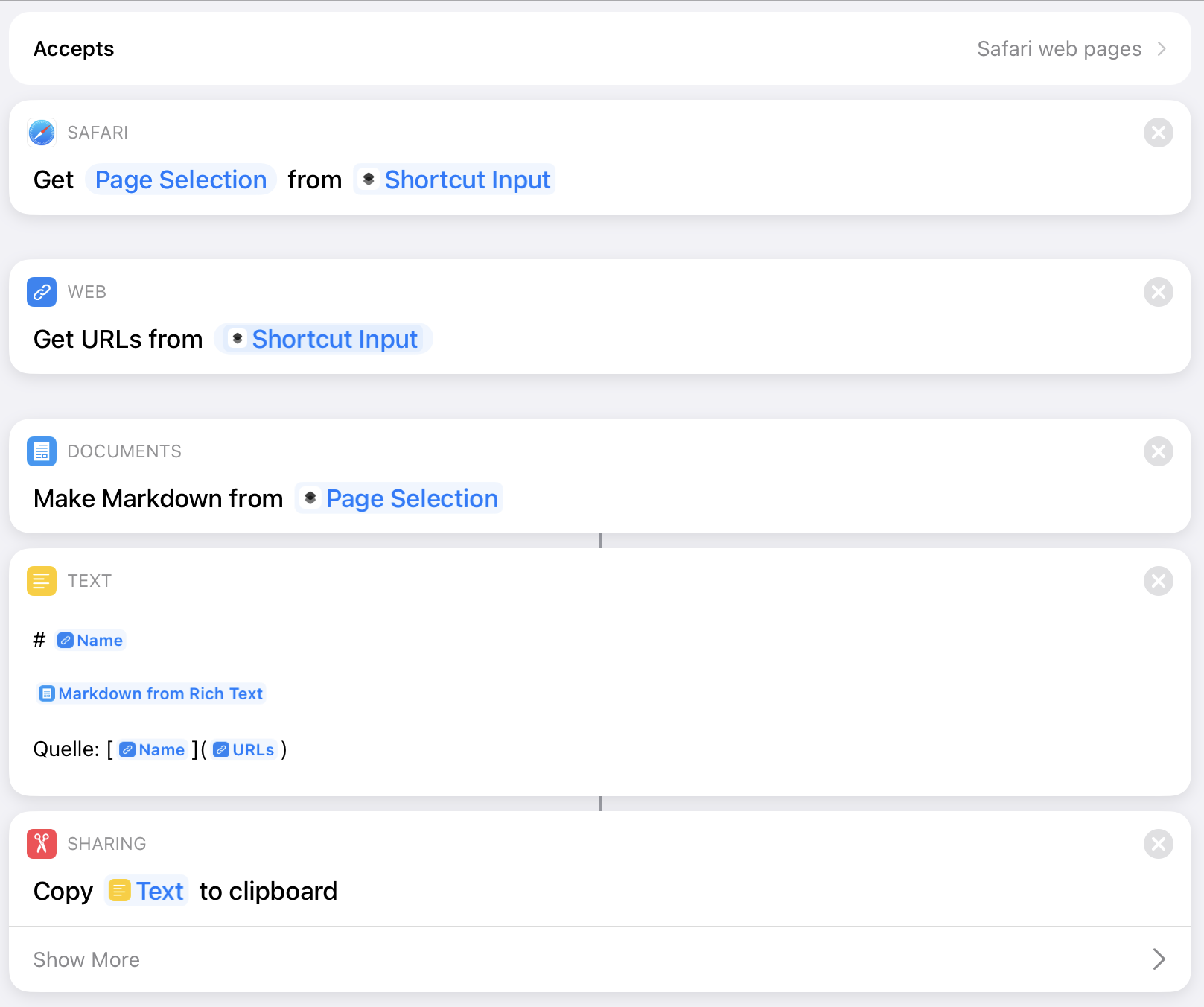
I’ve been working on a shortcut to clip a selection from a webpage rendered in Safari with a specific formatting to iA Writer. The shortcut worked, but only I managed to get the shortcut running once.

Every repeated execution would just not happen. The button in the share sheet will respond to a tap, but no activity is executed. Not only that, no other shortcut on the share menu will work after I ran my clip to iA Writer shortcut. The only way to get out of this is to force-restart the device1.

After the restart, the shortcut will (again) run successfully once, and then the mechanism for executing shortcuts seems to get locked up again.

For debugging, I split the shortcut in two parts. The first part will clip the text, apply the mentioned formatting to it, and copy the result into the clipboard:

Selection to Clipboard

This shortcut works just fine. And I can repeat this action as much as I want, no problem.

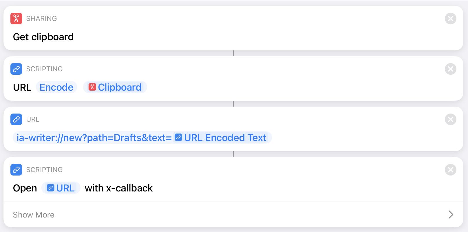
The second part takes the text from the clipboard, URL-encodes the text, and casts it into the URL scheme for getting the content into iA Writer:

Clipboard to iA Writer

Again, this part (for itself) works reliably, over multiple executions of the shortcut.

That’s right, the weird part about this is that I can run the two shortcuts independently from each other in succession without locking the shortcuts execution up as described above. Everything will work just fine and the text is reliably created in iA Writer just as it should be.

Having arrived at this point, I figured I might as well call the second shortcut from the first and let them (if this turns out to be the magic incantation) communicate via the clipboard. Maybe I could avoid the lock-up this way.

Nope, no such luck. The execution of shortcuts locks up again until I reboot my device.

As the next step in tracking this issue down, I have created a Python script in Pythonista that does exactly the same as the original undivided shortcut. The script runs just fine repeatedly, without locking up anything.

So, the takeaway from this experience seems to be that, unless I managed to create a bug in my own implementation, there might be some weird issue with shortcuts that execute URL schemes in general2 and are executed in the context of a text selection within a web page rendered in Safari.

This does not seem such an exotic combination that it never got properly tested. And yet, I have no other explanation for this phenomenon right now,


  1. I also tried closing Safari, the Shortcuts app, and iA Writer from the task manager, but this did not release the lock. 
  2. To let iA Writer off the hook, I tested the shortcut with a URL scheme for Bear. Same issue. 

Taio, three weeks after

After three weeks of using Taio, my initial interest in the app has significantly cooled.

At some point, the app started to change its default behavior for rendering CSV files in the editor. Instead of setting me up with a text editor view, Taio will render a CSV file in some sort of preview mode, i.e. as a table. But: as a consequence of this change, the file can no longer be edited after being loaded into the editor1.

Unfortunately, I haven’t found any preference setting that might impact this behavior that would enable me to leave this “accidental preview mode”. It also does not seem as if this “feature” is mentioned anywhere in the release notes.

In my previous article, I have complained about the rendering of footnotes in the preview being non-functional2. According to the release notes, the latest version3, Taio should now be able to render footnotes properly.

It doesn’t. It crashes on me if I try to activate the preview mode for the markdown source of, e.g. this article. Every single time.

That said, I stand by my initial verdict that I see the potential in Taio. But, at least from my personal point of view, the app clearly needs more time to mature before it can become a serious contender in the markdown editing and processing business.

Update (2021-04-03): The latest version of Taio fixes both the CSV rendering issue described above and the rendering of footnotes. My thanks to the developers for the swift reaction.


  1. Which is, to some extend, the point of using an editor. 
  2. Although the release notes of that version of three weeks ago also claimed to support the rendering of footnotes. 
  3. Which is 1.15.2, at the time of writing. 

Support for Markdown Metadata

Jason Snell and Dan Moren have published an interesting article about markdown text editing using different editor apps on Six Colors.

The article discusses the capabilities of a collection of iOS/iPadOS-based markdown editor apps, consisting of established contenders like iA Writer or Drafts, and the new hotness, Taio.

The authors also provided a handy table summarizing the pros and cons of the different apps at a glance. From my own perspective, one aspect was missing from the table and the entire article: the ability to correctly handle markdown meta-data during preview.

So here’s that additional table row, extended by two further apps (DEVONthink To Go and Keep It) that handle the storage and preview of markdown text:

Feature Taio 1Writer Drafts iA Writer Textastic DEVONthink To Go Keep It
Metadata No No No Yes Yes Yes Yes

Of all the apps in the table, iA Writer provides by far the best support for markdown meta-data. While other apps mentioned in the table restrict themselves to more or less tolerate meta-data, iA Writer goes one step further and supports the usage of meta-data to parameterize the markdown text.

iA Writer Preview

I‘ve had iA Writer installed on my devices for years and used it on and off. But only recently I discovered that the preview mode locks. If preview is activated then it will be applied immediately to all files loaded into the editor view until it becomes deactivated manually.

That‘s actually a nice touch. DEVONthink To Go has a very similar approach, i.e. markdown files are rendered in preview mode by default and a switch to edit mode requires a tap

Mastodon