Ars Technica reviews the Galaxy Fold

Ron Amadeo from Ars Technica has written a scorching review of the Samsung Galaxy Fold. I don’t remember ever reading a review of any product that comes even close to this.

And that brings us to today—the Ars review. This one is going to be a little different, since I don’t think the Galaxy Fold has any viability as a serious device anyone should consider purchasing. Should you buy a Galaxy Fold? NO! God no.

Amadeo leaves not doubt that the Galaxy Fold is an outright embarrassment in literally every single discipline. Not even the tiniest ray of light is visible at the end of the tunnel. And the only credit handed out to Samsung at the end of the text is for trying.

The Galaxy Fold fails at everything it sets out to do. It’s a bad smartphone and a bad tablet. The front screen is too small for phone duties like typing and reading. The interior screen is too small for tablet apps and split-screen apps, and it’s the wrong aspect ratio for media.

Unfortunately, I haven’t had any opportunity to get a first-hand impression of the device and therefore can personally neither confirm nor deny any of the observations. However, the rationale provided by Amadeo for rating the device a failure makes sense to me.

The launch of the Galaxy Fold was a disaster, and while Samsung fought through and got to market, that doesn’t mean the disaster is over. I’m still enthusiastic about the idea of a phone that converts into a tablet, but the Galaxy Fold puts on a master class of how not to do it.

Nevertheless, I feel sorry for the people who worked on this project. They must have been aware of the situation and the inevitable outcome. But apparently management put the priority on being first to the market rather than delivering a solid and mature product.

JetBrains Mono

Today, news broke to me that there‘s a new monospace and ligature-capable font specifically for developers out there: JetBrains Mono.

I have given it a try, and instantly liked it very much. My first impression is that it‘s very smooth and balanced, no extravagances.

The font comes in four weights plus italics for each weight. It supports code-specific ligatures1.

And it‘s free.


  1. I‘m a big fan of ligatures in my development fonts.  

The mysterious Alatsee

While on vacation in the vicinity of Füssen years ago, we have been visiting the Alatsee a couple of times. It’s a strange place, and a foul smell is in the air all the time. Here’s an excerpt from Wikipedia

Many divers have died or disappeared mysteriously in this lake due to the toxicity of the organisms living in this lake. These organisms create the “blood cloud ” that occurs quite abundantly throughout the year.

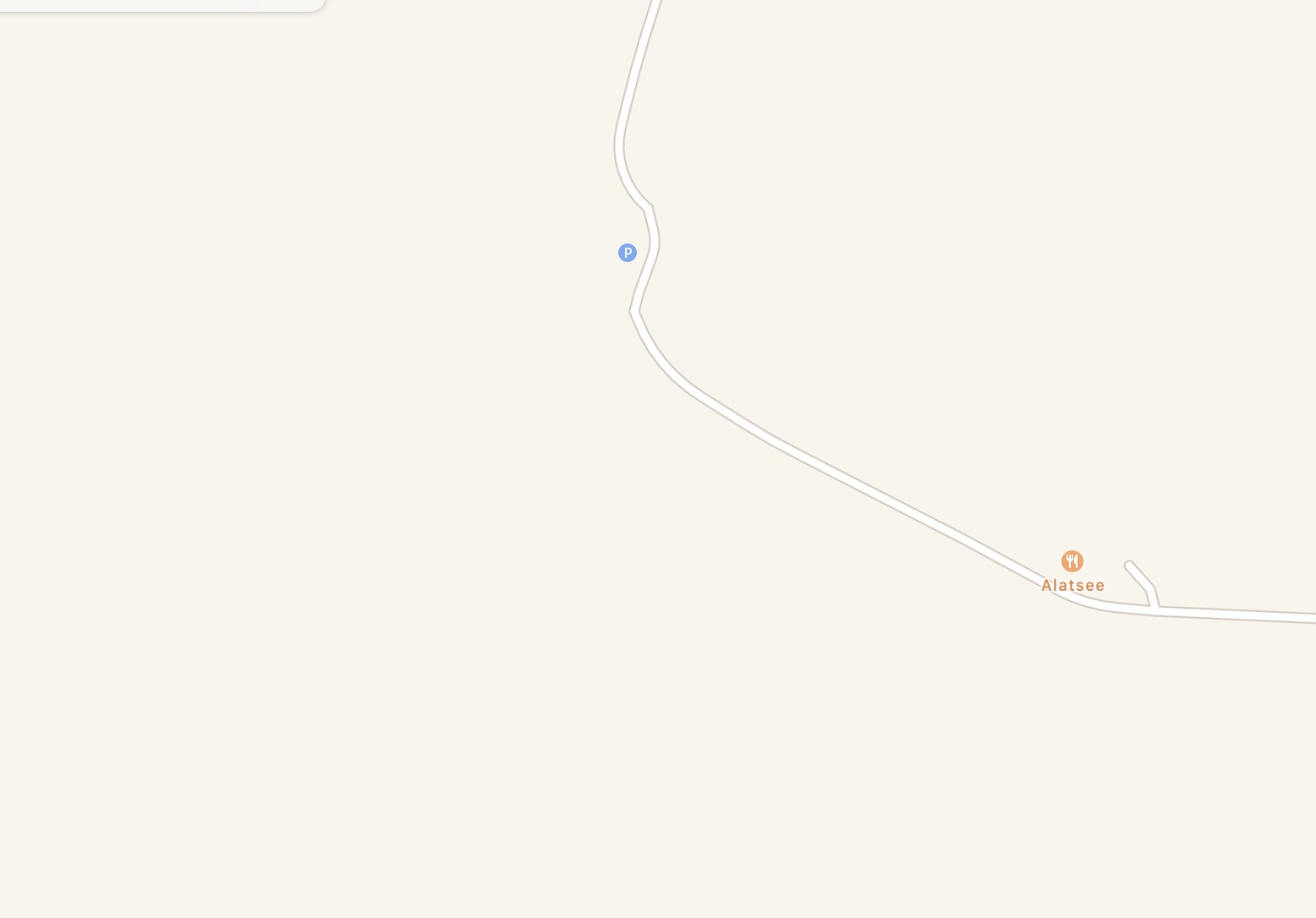
I noticed that the entire structures (streets, a restaurant) around the lake were correctly placed on Apple Maps. But the lake itself was simply not in the map.

Alatsee, where are you?

I think I reported this to Apple at the time, and I used to check back from time to time whether this gap was filled. Years passed and nothing happend. I always used to joke that it was only fitting that this mysterious place stubbornly refused to appear on the map.

Of course, that joke has been on Apple. Other map services, like OpenStreetMap included the lake at the correct position1 just fine.

Alatsee on Open Streetmaps

Today, I checked again.

Ah, that‘s better
Ah, that‘s better

And, yay, this time the outline of the lake is correctly appearing on the Apple Maps. Improvements, one mystery at a time.

  1. And in much greater detail!

Paperlike 2 Screen Protector

I really like the idea of devices that accept touch input, but at the same time touch input is a huge bane because of the inevitable fingerprints. Especially the iPads1 that work with the Apple Pencil are real fingerprint magnets2. Cleaning the display is possible, yet pointless.

A couple of weeks ago, Marco Arment mentioned the product Paperlike3 in passing during (I think) episode 353 of the Accidental Tech Podcast (ATP). According to the discussion on the show, the product was considered promising, but had some significant shortcomings in terms of refraction artifacts that might have been fixed in a newer version that was about to hit the market soon.

A couple of weeks later, the topic came up again and was concluded with a recommendation for the new product, Paperlike 2. This was enough for me to place an order that arrived shortly before Christmas at my home.

I appreciate that the people behind Paperlike 2 have put effort into the creation and documentation of a multi-step workflow for applying the screen-protector to your device. I was able to apply the Paperlike 2 just fine at the first try.

After one week of using my iPad several hours a day, I do not regret the purchase nor do I feel any desire to remove the screen protector from my iPad again. The effects of finger oil on the display are drastically reduced while the reduction in display quality in comparison to the „unprotected“ display is very minor and – so far – absolutely tolerable. In particular, I did not recognize a meaningful amount of refraction artifacts on the display.

I’m curious to find out how the Paperlike 2 performs in the long run and how durable it turns out over time. So far, the screen protector has suffered from some superficial scratches caused by using the Apple Pencil for writing and drawing. And the product does what it says on the tin, the feedback from the surface while using an Apple Pencil has improved without question. Plus, the matte finish reduces glare significantly.

In summary, I’m impressed by the results so far. I would not have expected such a good job from any screen protector on the market4.

  1. There‘s a whole range of iPad models that are compatible with either generation 1 or two of the Apple Pencil.
  2. Apple‘s marketing parlor is all about „oleophobic surfaces“. But in reality, the term „oleophilic“ would almost certainly be more accurate.
  3. The product is sold in reference to being as close as possible to the haptics of real paper. The topic of being less of a fingerprint magnet is seemingly not considered a selling proposition.
  4. I’ve had some experience with screen protectors already, and none of them really made me want to continue using it.

6502

Around mid of December, news broke that Chuck Peddle had passed away. He was known for being the lead designer of the 6502 microprocessor. The 6502 was used to power, e.g. the VIC-201, the C64, and the PET, all made by Commodore International.

I still have my VC-20 stored in the basement. I bought in the summer of 1983 with nearly the entire money I had earned from 6 weeks of work during the school summer break. This purchase not only made my parents become seriously angry at me, it also set the early foundation for my future career.

Like everyone else who did not buy such a machine for gaming, I started to program the VIC in Basic. And that might have been the end of it because the very limited resources of 3.5 KB of RAM2 probably wouldn’t have given me much excitement in the long run.

Time passed, and I ended up with a ROM listing3 and instructions about programming the thing in machine language. That‘s right, machine language. I don‘t remember exactly whether an assembler existed for the VC-20. I, at least, had to put the machine instructions in the correct order manually. Oh, such fun.

Years later, when working on the implementation of some very time-critical, driver-level routines in 8086 assembler on a PC, I was finally able to understand the genius of the 6502 design in comparison to 8086 and how much it had lowered4 the barrier of entry for me.

Thanks, Chuck Peddle. RIP.

  1. In Germany, the VIC 20 was marketed as VC-20.
  2. Later, I bought a memory extension cartridge worth of 32 KByte.
  3. The book is titled „VC-20 Intern“ and is also still in my book shelf.
  4. I honestly don‘t know what might have happened if I had been confronted with the 8086 architecture in the first place.

Reboot to Update

I have to say that — until now — I have been1 among the lucky ones that haven‘t been plagued by any weird iOS or iPadOS 13 bugs. But now, my iPad suddenly requires a restart prior to being able to update any app from Apple‘s app store.

That‘s right, I have to do the „press sleep and home2 at the same time until the bright apple logo shows up“ dance.

Every. Single. Time.

In hindsight, I‘m not sure really when the issue started to show up. It may just as well have been caused by the update to iPadOS 13.2.2. My iPhone3 in most cases, but not always, also requires a reboot before successfully managing to install updated apps.

What happens is that, after pressing the update button, the App Store app shows the spinners as an indication that the update is about to start. Then, the familiar circle (drawn with a thin line) with a square in the middle shows up. And then, nothing. The App Store app can keep this status all day, it I let it.

I tried updating apps individually, or in concert. I tried disconnecting the data communication, and then connect again before repeating my attempt to update. I tried touching the central square to abort the update procedure.

Nothing works, a restart is required in 100% of such cases. I haven’t read about this behavior or listened to people talk about it anywhere. But it’s there, and I guess it won’t leave me alone on its own.

Therefore, I sincerely hope that the next update down the road fixes the issue, because this really sucks.

[Update]: After a couple of days running iPadOS/iOS 13.2.3 it seems that the issue has indeed be fixed with a software update. I can update my apps just fine again.

  1. Even during the beta phase of iPadOS.
  2. My iPad is a 10.5” Pro model.
  3. Which is also on 13.2.2.

QuickPath

My introduction to the world of slide keyboards happened sometime after custom keyboards were allowed in iOS1. I tried some of the available keyboards and ended up using SwiftKey since then.

My experience with SwiftKey has been mostly positive.2 The rate of correctly interpreted gestures is not at a 100%, not even close. But it is close enough to keep me using the slide keyboard. My preferred style of work has been to slide entire sentences and then start editing the mistakes away. In total, this approach has still saved me some time3.

Given that history, I admit to have mixed feelings about Apples announcement of a slide keyboard named QuickPath in iOS/iPadOS 13. After all, SwiftKey and similar products have been in the market for many years. These guys got to have some advantage over a newcomer in the field, right?

During the beta, and after iOS/iPadOS 13 was released, I took my time taking the QuickPath keyboard for a spin. Given my confidence in SwiftKey, I wanted Apple’s implementation to have a fair chance. I admit that I was expecting it to fall behind the experienced competition. But I wanted to get a clear picture of the failure rate before I cast my verdict and return to SwiftKey.

The outcome of all the time I spend sliding text into my devices using the new keyboard is that I am more than impressed by the QuickPath’s capabilities. In comparison with the results I get from using SwiftKey, the quality of correctly interpreted gestures is significantly4 closer to 100%.

Given the quality of results I personally get out of using the keyboard, it is probaly safe to assume that QuickPath has secretly been years in the making. There is just no way that this is the result of the iteration of building a slide keyboard at Apple. In what otherwise would be called “typical Apple fashion”, at least this feature of iOS 13 shipped when it was ready5.

For most of the time, I still type longer texts6 using a hardware keyboard. But in the past, I always made sure to take my hardware keyboard for the iPad with me when traveling. This is no longer the case. Despite all the bad press that iOS 13 (to some extent) rightfully gets, this single feature is a roaring success in my books.

That said, does the release of QuickPath represent a sherlock-level event for SwiftKey and the like? Maybe. I personally struggle to find a relevant feature7 of SwiftKey that puts it ahead of QuickPath, but maybe that’s just me. Nevertheless, competing on a platform with the platform’s vendor admittedly is super-hard, but not impossible.

  1. If I remember correctly, this would have been around iOS 8.
  2. I never used to “cloud” features of Swiftkey.
  3. I have to admit that thumb-typing never clicked (no pun intended) for me. I understand that the yield can be phenomenal for those who really master it.
  4. Like … night and day. Using Swiftkey, I was always struggling to correctly slide two-letter words where the two letters are located next to each other on the keyboard. Example: the German word “zu”. Apple’s keyboard masters this particular challenge like a champ.
  5. Yes, I understand the irony of this statement with respect to many other features in iOS/iPadOS 13.
  6. like this one
  7. Yes, I know that SwiftKey has the ability to learn your writing style from your social network activities. But QuickPath can learn your writing style from everything you write on the device.
    And, yes, SwiftKeyprovides different keyboard skins. Personally, I am not the type of person who needs this kind of distraction and I always used the most neutral skin available.

The little joys of iOS 13

I can’t remember one feature being mentioned on stage during the iOS 13 introduction at WWDC: you can control the language of apps on iOS 13 individually in Settings.app, provided that the app itself supports more than one language.

While I strongly prefer to use English as the primary language on operating system level1, there are some apps that I always wished I could run in my native German language.

But unfortunately, this was not possible in iOS 12 and before. Unless an app itself offered the ability to switch to a different language (and German was a choice) you were out of luck.

But again, in some cases it makes much more sense to run an app in German. A prominent example is the DB Navigator2 app by Deutsche Bahn, or any other public transport app of any German-speaking city that I regularly travel to. It just feels more … natural.

I’m very happy about this unheralded little nugget. It will certainly improve my iOS experience a lot.

  1. When I started using computers – for a long time – the choice was to either have English skills or stop using computers.
  2. Don’t worry, the English localization is much better that the proverbial English skills of the DB staff that people sometimes make fun of (albeit in a good-natured fashion).

The App that never sleeps

The other day, I picked my phone from the pocket and noticed that the Halide camera app was on. That’s right, I did not have to unlock the phone.

After using Halide and carelessly 1 putting the phone in my pocket, it stayed there for quite some time while Halide was obviously running in the foreground the entire time and so I ended up with a drained battery way too early in the day.

I tried to find information about why the phone wasn’t locked automatically while Halide was in the foreground. But I could not find anything specific. But at least I was able to successfully reproduce the behavior: Halide just wouldn’t trigger the auto-lock.

I tried other camera apps: Apple’s own Camera.app keeps the phone unlocked for about five minutes and Obscura 2 implements an even shorter timeout for locking the phone. Neither app seems to have any preference2 setting that affects the activation of auto-lock after the globally configured time period.

Mysterious and potentially undocumented behavior aside, I don’t think I want a camera app on my phone that keeps the phone awake indefinitely. I can see the point of keeping the phone awake in the hunt for a perfect shot. But in my opinion, the risk of ending up with a completely drained battery entirely cancels out the utility of Halide’s vigilance.

Maybe the fo … tography is not strong enough in me.

  1. In the assumption that the phone would lock itself after the configured auto-lock period expired.
  2. Sure enough, the official iPhone User Guide available off of iOS’s Books app did not mention anything specific in the chapter about Camera.app.

Wishlist for Unread 2

While I am a big fan of Reeder I still use Unread more or less heavily for reading my RSS feeds1. The developer of Unread recently pre-announced the release of Unread 2 as the next evolution step of the popular feed reader.

Apparently, it is too early to publish any information about new features, but the announcement still got me started to think about what features I would personally want from the new release. Here’s a list:

  • Ability to filter for all and starred articles (in addition to the currently implemented new articles). Minimal UI, I know. But still, I’d find this very helpful.
  • Keyboard shortcuts. The support for keyboard shortcuts would add nothing to the UI and still be helpful in many cases.
  • Change fontsize in smaller increments, at least on the iPad. Currently the difference between two increments is the difference between too big and too small. It’s hard to hit the perfect size, especially on the iPad.
  • Readability view on a per-feed basis. This would keep the friction of using the app low because one tap is saved to switch to readability mode.
  • Administration of subscriptions. Add, rename, and remove feeds. Move to folders.

Of all of those wishes, I want the smaller increments in fontsize the most. I read most of my feeds on the iPad, and this factor would give me the most benefit out of a new version of Unread.

  1. Sometimes I prefer the versatility of Reeder and sometimes I’m more about a minimal UI to concentrate on the process of reading itself.
Mastodon